MacOS Big Sur: Cool new features and borrowed tricks in the public beta
Apple wants to turn its computers up to 11 with a major overhaul to the software that runs MacBooks, iMacs and more.


- Jason is an award-winning journalist, editor, and video host with a passion for covering cutting edge innovation.
MacOS 11 Big Sur brings big changes to Mac computers.
Now that Apple has released the public beta of MacOS 11 Big Sur -- with the iOS 14 and Watch OS 7 public betas already in the wild -- anyone with a compatible Mac can try out the new software that offers a fresh coat of paint and new ways of working on MacBooks , iMacs , Mac Minis and Mac Pros.
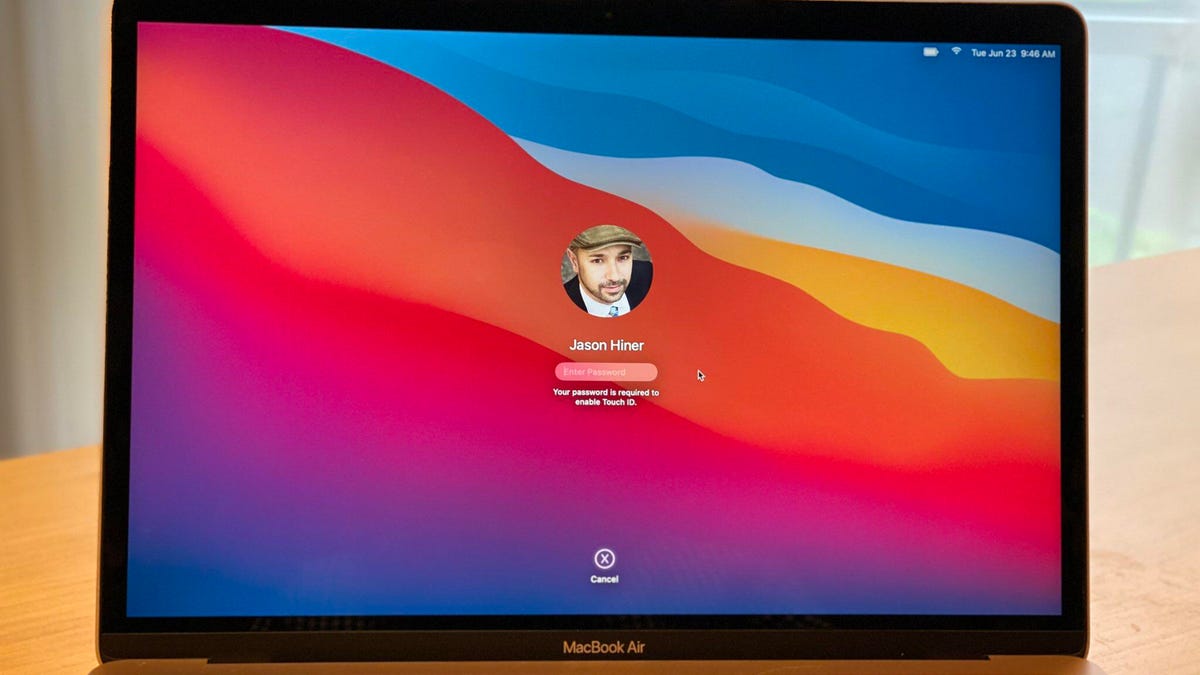
After 19 years of MacOS 10 (aka Mac OS X), Apple christened Big Sur as the version to mark the transition to 11 and called it the biggest design update since the original launch of Mac OS X in 2001. That alone makes it an update worth kicking the tires on, and you can do that if you have an extra Mac that's compatible with Big Sur. We don't recommend you install this or any other beta on a machine you rely on to get work done, so we'll take you through the most interesting new stuff.
I've been using Mac computers since System 6 in the late 1980s and so I would love to dive into some of the geekier parts of the new MacOS, like the new boot mode that prepares it for the upcoming transition to Apple silicon, its in-house chips. But, we'll save that stuff for breakout features when the final version of Big Sur is released this fall and computers using Apple silicon arrive at the end of the year.
For now, let's do a quick survey of the features that most people will notice.
Read more: New Apple 27-inch iMac: Hands-on with a work-from-home beast
The best new stuff

1. Fresh design: Of all the new MacOS versions over the past two decades (and I've tried each one), this one definitely introduces the most visually noticeable changes once it's installed. The menu bar at the top of the screen is now more transparent and the menu items have more space between them to make them easier to read. The dock now floats on the screen and is also more transparent to let the background show through. The windows have a lighter, brighter appearance and more rounded edges that more closely match the angles of Mac hardware like the MacBook.
2. A new Safari: Other than the general changes to menus and windows, the next most noticeable thing for most users will be the major overhaul to the Safari web browser. And virtually all of the changes are improvements. The best one, from my perspective, is how Safari handles tabs -- more like Chrome or Firefox -- by no longer automatically collapsing tabs, which used to frustrate me every day. Safari also introduces previews when you mouse over a browser tab to help you find the one you're looking for. The new Safari also brings a built-in privacy report for each site, an automatic translation feature, more support for browser extensions and a customizable start page that's pretty useful.
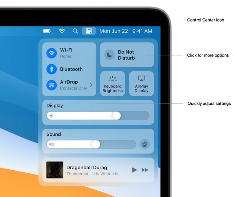
3. Widgets and Control Center: Taking a page from the iPhone and iPad , Big Sur imports the Control Center and Widgets. The Control Center makes it easier and faster to configure settings like Wi-Fi, Bluetooth , AirDrop, Keyboard backlighting, Display brightness, Sound volume, Do Not Disturb and Screen Mirroring. Widgets function very similarly to the ones on iOS and iPadOS -- and not like the old widgets in Dashboard from Mac days gone by. Only Widgets for built-in Apple apps are available for now -- Weather, Stocks, Reminders, World Clock, Photos, Podcasts, for example -- but we should expect developers of apps to start toying with these.
4. Messages: Another feature that's taking inspiration from iPhone and iPad is the Messages app, which has lagged behind its cousins in features for years. Apple is trying to catch up and is also working to bring new features introduced in iOS 14 to the Mac version of Messages as well. Some of the new stuff Mac users will appreciate includes: better search functionality; the ability to pin people and conversations at the top of your list; better group messaging features, including mentions and inline replies; Memoji stickers; and a built-in GIF library.
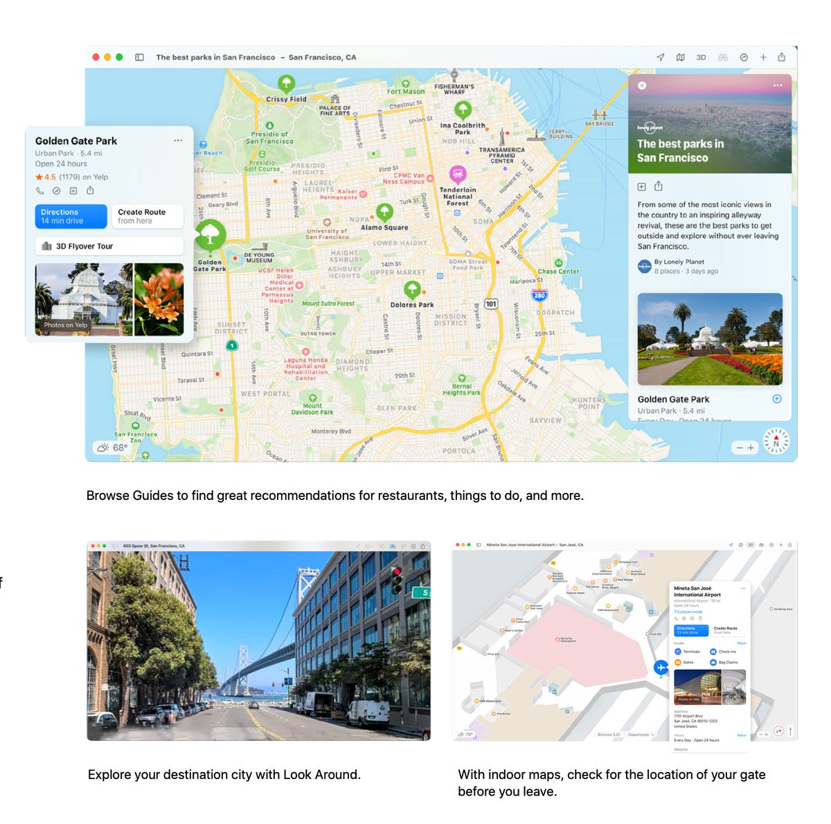
5. Maps: The Maps app is getting key updates on Mac at the same time as these new features are also coming to iPhone and iPad. These include indoor maps of airports, shopping centers and malls, expanded 3D Look Around and 360-degree views of sites in major cities, and Guides of major landmarks and areas.
Read more: MacOS Big Sur download: Here's how to try Apple's new operating system early
Two complaints
1. No desktop widgets: While the widgets look generally well implemented so far, the biggest downside is that they're stuck in the notifications area. Unlike iOS 14 and iPadOS 14, where you can now drag widgets onto the home screen and leave them there, you can't drag them onto the desktop in Big Sur. This is a big disappointment, especially because a Mac has so much extra desktop real estate.
2. Inconsistent and unappealing icon design: With some of the internal Apple apps on Big Sur, Apple has introduced new icons that have heavy shadows and look comically out of place. This is especially true with Messages, FaceTime, Mail, QuickTime and Preview, for example. Rather than make these match the simple, flat design that has come to distinguish icons across iOS and throughout the tech landscape in recent years, Apple gave these icons old-school shading and dimensionality that sticks out badly next to icons of popular apps like Google Chrome and Zoom, which use standard flat design. This is a small annoyance, but it blights what is generally a visually appealing upgrade.