Track COVID-19 risk in your county with Harvard's assessment map
The map lets you see how close the coronavirus is to home.


- She received the Renau Writing Scholarship in 2016 from the University of Louisville's communication department.
A look at the US on July 1, 2020.
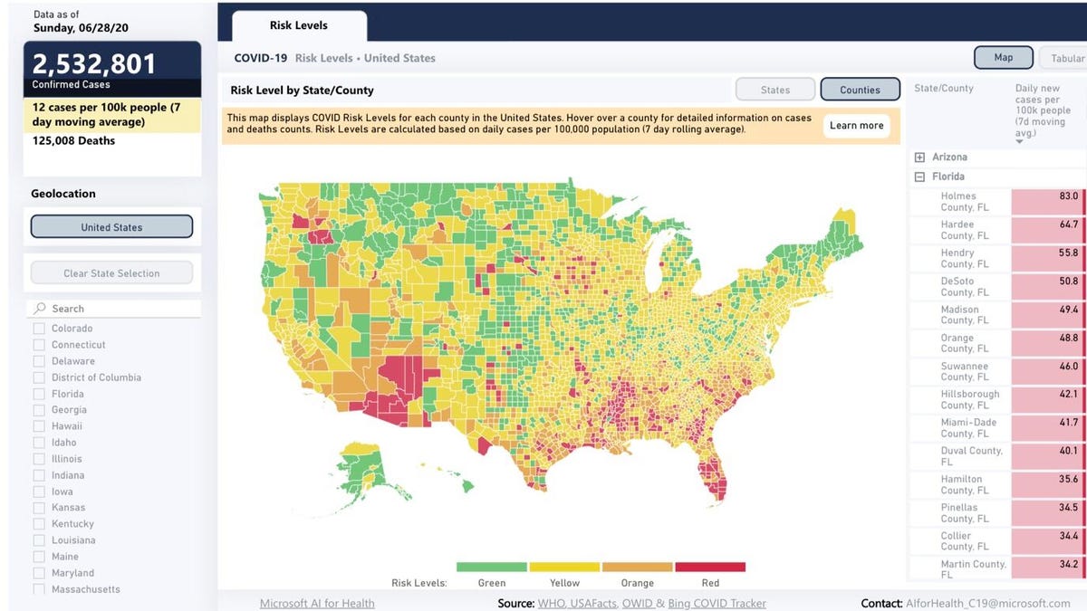
The Harvard Global Health Institute has developed a color-coded map that can make it easier to determine the COVID-19 risk in your county. The map represents risk in counties as red (more than 25 new cases per day per 100,000 people), orange, yellow and green (less than one new case per day per 100,000 people). The colors also indicate measures like contact tracing, rigorous testing and stay at home orders.
The map is meant to give users a better way to examine their specific location, as opposed to the larger scope provided by Johns Hopkins University's COVID-19 database.
"Robust TTSI [testing, tracing and supported isolation] programs are key on the pathway to suppression. We need to consistently apply data-driven testing of hotspots, combined with contact tracing based testing, especially in states where case numbers are rising rapidly," Ashish K. Jha, director of the Harvard Global Health Institute, said in a release. "It is what we need to get the virus level so low that we don't have large numbers of people getting sick and dying and that we can open up our economy."
You can zoom in and out to find your state and county. Once you've found your locale, the map can show you daily new cases of COVID-19 per 100,000 people on a seven-day rolling basis; the color your location is assigned on the map; the number of cases; and the number of deaths. You can also filter your search. On the left side of the map, you can select specific states to make it easier to find your county. On the right side of the screen, if you've selected a state, you can click the plus sign and scroll through the individual counties.